BrandingLogo Design
Otter Massage
Student: Morgan Fude
This project began as a long-standing personal concept to design branding for a massage company inspired by otters. Otter Massage was created as an imaginary business that combines the calming nature of massage therapy with the playful, endearing qualities of otters. The visual identity focuses on softness, flow, and approachability, using rounded shapes and gentle design elements to reflect relaxation and comfort. Otters are often associated with warmth, connection, and ease—characteristics that align naturally with the goals of a wellness brand. The logo was designed to feel friendly and inviting while still maintaining a sense of professionalism appropriate for a massage practice. Through cohesive typography, thoughtful composition, and balanced visual elements, the branding communicates both tranquility and trust. This project demonstrates how a lighthearted concept can be translated into a functional and believable brand identity, showing an understanding of tone, audience engagement, and the emotional impact of design choices.

About the Designer
Morgan Fude
Hello! I am a passionate beginning designer who puts my heart and soul into every project I undertake. With an open mind and a strong desire to grow, I am always eager to learn new techniques, refine my skills, and stay ahead of industry trends. My deep love for creative design fuels my commitment to delivering thoughtful and innovative solutions, ensuring that each piece I create is a reflection of my dedication and artistic vision.
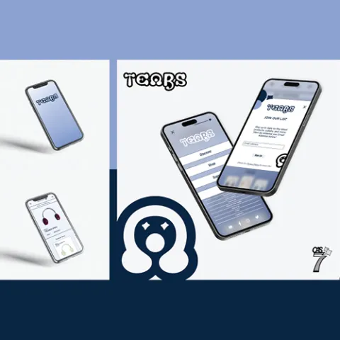
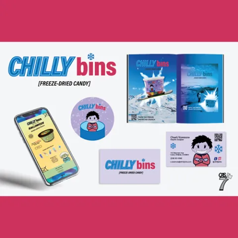
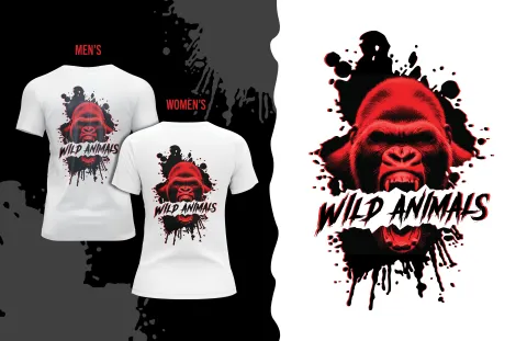
More Branding Projects
View all →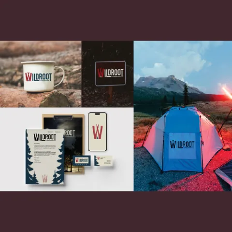
Explore More Work
Browse all student projects or learn about the Graphic & Web Design program.