PUNK MUNK Cookie Brand Packaging and Advertisement
Student: Anna Foster
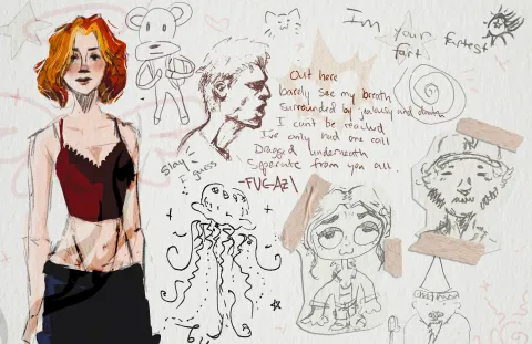
This is a packaging design for a cookie brand 'PUNK MONK'. This was inspired by a messy punk aesthetic. I wanted to name all of the cookie flavors after famous punk songs or bands, so this flavor is called 'White Riot' - The Clash.


Process
1
Step 1
About the Designer
Anna Foster
Anna Foster is one of the many graduating Graphic Design students this year. She finds her stylistic focus around gritty and "messy" looking design. She finds inspiration through music and pours creative energy into every outlet she can. She aspires to start an independent merchandising agency for bands in the area. Until then, she finds her spot in the local social media and marketing side of design. She finds herself wanting to pursue further education in business and fine arts to boost her skills and qualifications.

Explore More Work
Browse all student projects or learn about the Graphic & Web Design program.