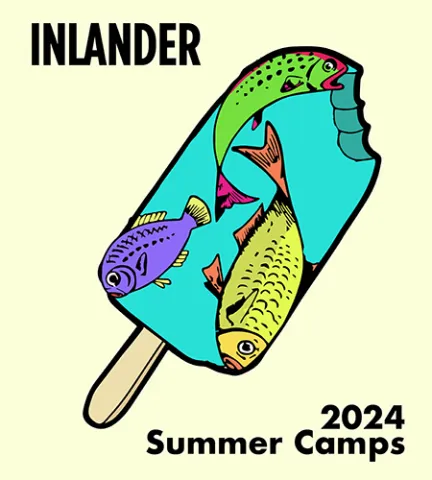
Watermelon Inlander Poster
Student: Amylouise Smith

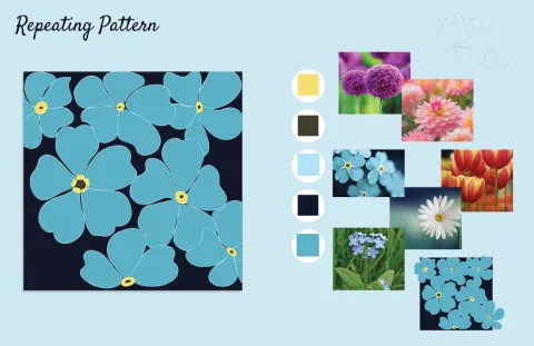
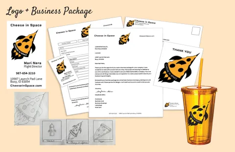
Process
Step 1
About the Designer
Amylouise Smith
My name is AmyLouise Smith and I am a graphic design student with a strong interest in illustration and visual storytelling. I enjoy creating designs that are colorful, engaging, and concept driven. A lot of my work focuses on combining illustration with graphic design elements to create pieces that feel both creative and visually clear. When I start a project, I usually begin with sketches and research to explore different ideas before moving into digital design. I enjoy the process of experimenting with concepts and refining them until I find the direction that works best. Many of my projects are inspired by themes like nature, travel, and imagination, which often show up in my posters, patterns, and illustrated designs. I also like exploring different areas of design such as branding, poster design, and publication layout. Through these projects, I try to focus on creating work that communicates clearly while still feeling fun and visually interesting. As I continue studying graphic design, I hope to keep developing my illustration style, strengthen my design skills, and create work that connects with people.
Explore More Work
Browse all student projects or learn about the Graphic & Web Design program.